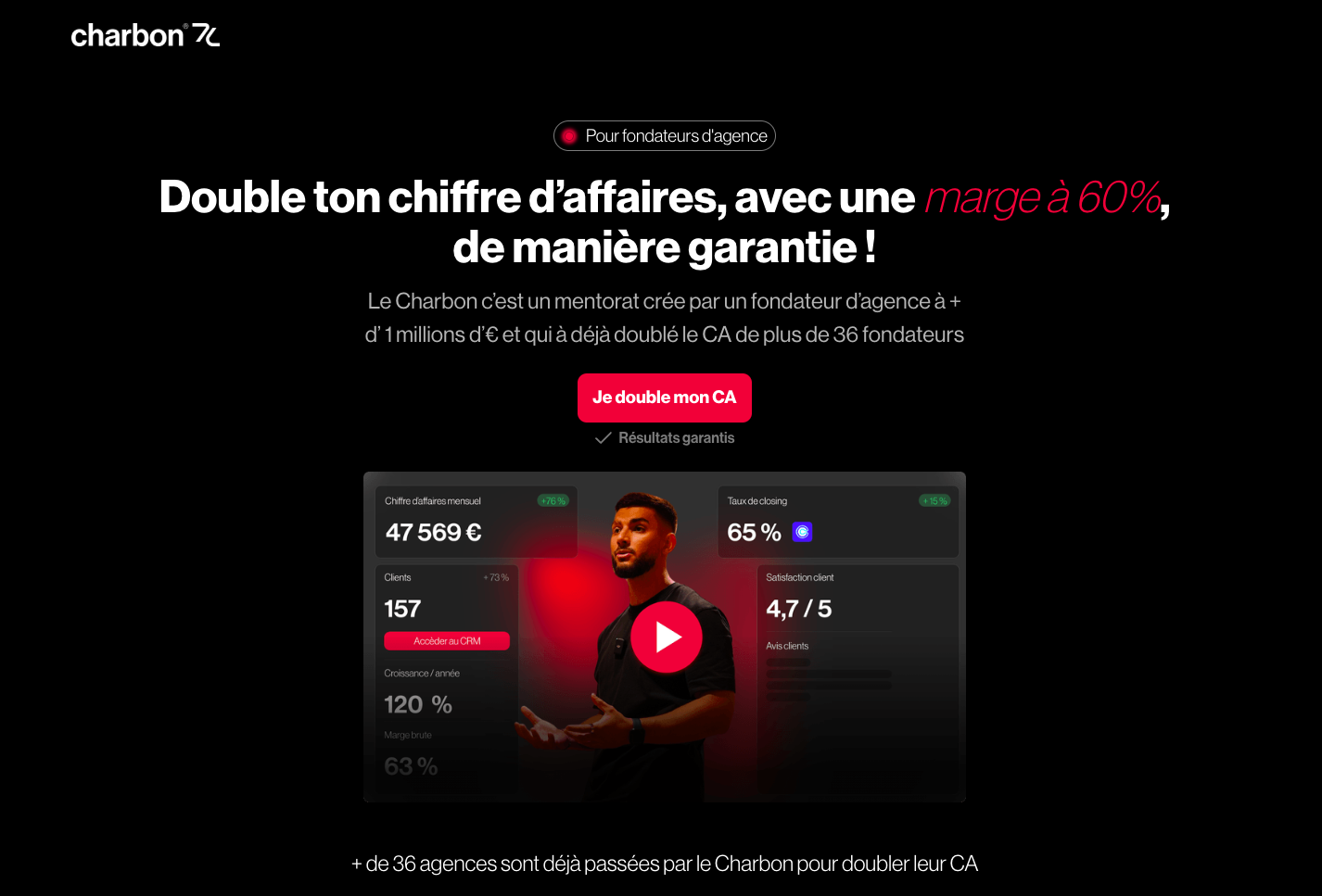
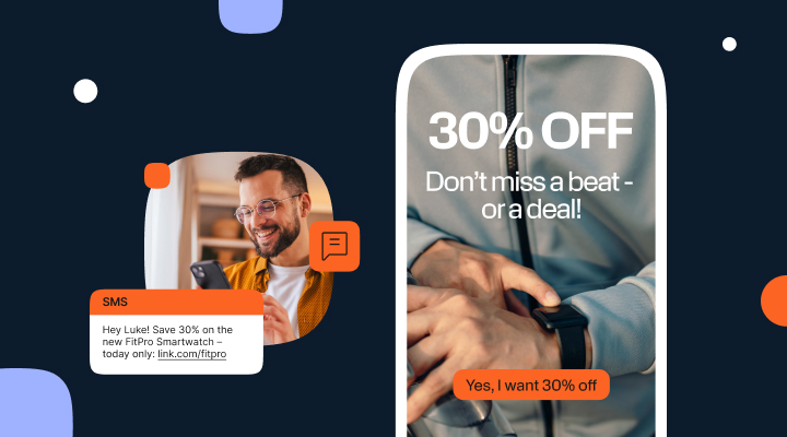
The sms landing page pairs a short text message with a mobile landing page. The idea is simple. An SMS contains a short link. The user taps it. They arrive on a dedicated landing page designed to inform and convert. This SMS + dedicated page duo aligns reach, speed, and precision. Used well, it becomes a powerful lever to accelerate your campaigns.
Below you’ll find a practical, modern guide. It covers strategy, design, measurement, compliance, and continuous optimization. You’ll be able to deploy your SMS campaigns methodically. Most importantly, you’ll know what to improve at every step.
What is an sms landing page and why use it?
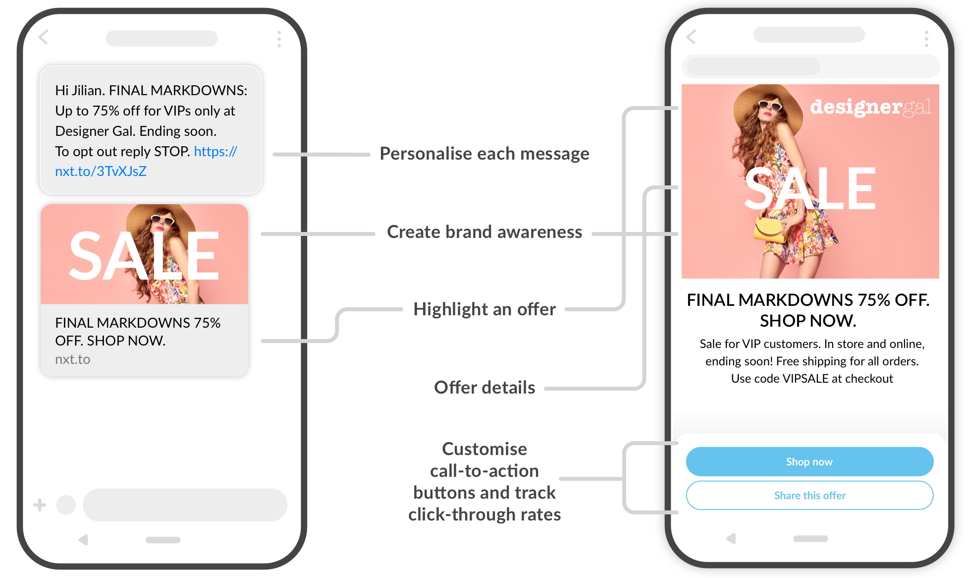
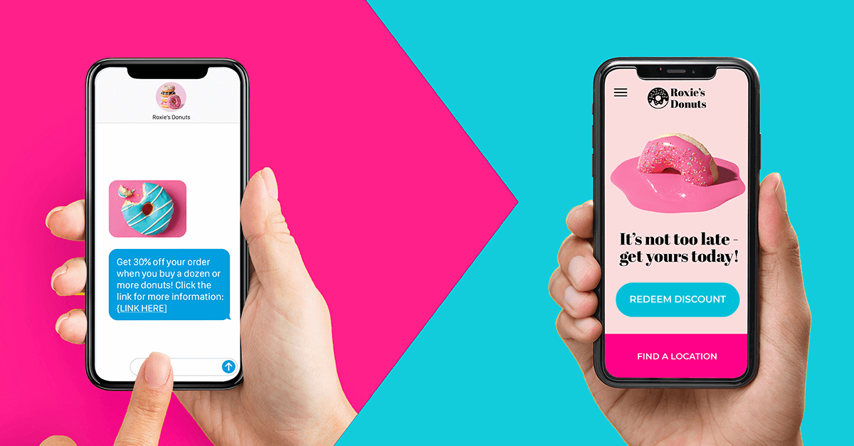
An sms landing page is an SMS with a link that sends the recipient to a single page. That page presents a targeted message, a clear CTA, and sometimes a form. The SMS format offers unrivaled delivery speed. The mobile landing pageadds context and proof. Together, they create a short but complete experience.
The benefits are many. Access is universal on smartphones. Content is customizable. Results are measurable. Costs stay under control. Finally, this channel plugs into most marketing stacks without friction.
Why the sms landing page works today
Inboxes are saturated. Social feeds are volatile. SMS remains direct and is read quickly. The page after the tap completes the story. It answers questions. It reassures. It guides the user to action.
Mobile has become the primary screen. It demands pages that are fast, simple, and results-oriented. The sms landing page fits this context. It delivers a short message, then unfolds the details on a mobile-first UX page.
Goals to target with an sms landing page
Before you design a page, set a single objective. Just one. It helps you write and measure. Common cases include:
- Generate a qualified click to a limited-time offer.
- Capture a lead via a short form.
- Trigger a purchase with a clear discount.
- Drive a guide or app download.
- Invite to an event with calendar add-to links.
Each objective deserves a distinct copy angle. The CTA must reflect it without ambiguity.
Anatomy of a convincing sms landing page
A winning sms landing page aligns three elements: message, link, page. Each must play its role.
The SMS: short, clear, action-oriented
State the value in one sentence. Indicate the benefit and the expected action. Include a deadline if relevant. Avoid jargon. Keep a human tone. Simple personalization (first name, segment) improves attention.
The link: short, trackable, trustworthy
Use a branded short link when possible. Add UTM parameters. You’ll track performance effortlessly. The link’s domain should inspire trust. Tracking must not slow the load.
The mobile landing page: fast and focused
The H1 restates the promise. The subhead clarifies the offer. The CTA is visible above the fold. Proof elements sit close to the button. Content is scannable, with short sentences and readable lists. Everything should load in under three seconds.
Designing content for an SMS landing page that converts
Content must be useful, specific, and free of clutter. Here’s a simple, effective blueprint.
Hook and promise
Announce the primary benefit. Talk about the outcome, not about you. Avoid empty slogans. A concrete promise is remembered. It reassures from the first second.
Immediate reassurance
Place social proof near the CTA: average rating, number of users, logos. A guarantee or trust badge strengthens confidence. Perceived friction drops.
Useful detail, no digressions
Explain the real value in three points. State what users gain, what they avoid, and in how much time. Every line should serve the action. Everything else can go.
Call-to-action
Your CTA must be clear, precise, and written in the present tense. Show what happens after the tap. Repeat the button lower down if the page scrolls. The button copy matters as much as its color.
Personalization: turning the sms landing page into a tailored funnel
Personalization is not limited to a first name. It should rely on signals:
- Segment (prospect, customer, VIP).
- History (recent purchase, abandoned cart).
- Location (nearby store, available stock).
- Context (weather, day, event).
Use dynamic URL parameters. The page can display a specific price, a tailored image, or a contextual deadline. The promise feels made for the user. It will be received better.
Major use cases for an sms landing page
The format applies to many scenarios. These are the most frequent.
Product launch or update
A short page presents the new feature. A brief video shows usage. A CTA offers a trial, preorder, or demo.
Sales and promotions
Sales, private events, limited offers. SMS creates urgency. The page shows the code, conditions, and proof the offer is real.
Review collection and NPS
After a purchase, send a link to an ultra-light page. Two questions, one optional field. More responses come in when the path is simple.
Event registration
The page summarizes venue, date, and agenda. A button adds the event to the calendar. An embedded map reassures. Conversion increases.
Payment reminders and soft collections
A dedicated page explains the due date. It offers secure payment. The tone stays courteous. Thoughtful UX reduces tension. Payment becomes more likely.
Measuring an sms landing page without getting lost
The format’s power also lies in measurement. Define your KPIs before sending.
- Delivery rate: messages delivered.
- CTR: link taps.
- CVR: on-page conversions.
- Time on page: real interest.
- Abandons: frictions to fix.
UTMs feed your analytics. A mobile heatmap reveals ignored zones. Form events pinpoint precise friction.
Optimizing an sms landing page with A/B testing
Test one thing at a time. Set a clear hypothesis. Define your statistical threshold.
Variables on the SMS side
- Promise angle.
- Link microcopy.
- Deadline placement.
- Personalization on/off.
Variables on the landing side
- More concrete H1.
- Usage image vs product image.
- Two-step form.
- Result-oriented CTA text.
Start with elements visible without scrolling. Gains are faster there.
Speed, design, accessibility: foundations of a fast SMS landing page
Mobile won’t wait. Performance affects conversion.
- Serve compressed WebP images.
- Minimize JavaScript.
- Prefer system fonts when possible.
- Respect contrast ratios for accessibility.
- Provide comfortable tap targets.
Some visitors will have middling networks. The page must stay smooth regardless. A lighter variant can be planned.
Compliance and trust: responsible sms landing pages
Following the legal framework is not optional. It builds trust. It also protects your brand.
Opt-in and opt-out
Users must have consented. The message must allow an easy unsubscribe. These rules must be followed without exception.
Data and transparency
Explain the purpose of processing. Collect only what’s necessary. Do not store longer than planned. Transparency will be appreciated.
Sending window
Avoid sensitive hours. Consider time zones and holidays. Messages will be better received.
Writing the SMS for an sms landing page that people want to tap
A few lines are enough, but they require rigor.
- Start with the value: what the person gains.
- Add a useful context cue.
- Make the action obvious.
- End with a verb of action.
Clarity comes first. A human tone helps. Excessive hype hurts credibility.
Building the SMS landing page step by step
Here is a simple method to replicate.
- Single objective and associated metric.
- Concrete promise in the title.
- Proof placed near the button.
- Precise CTA, in the present tense, above the fold.
- Useful details, in three points max.
- Short form, fields adapted to mobile.
- Minimal footer, no distracting links.
This short format forces the essentials. That is its biggest strength.
Common mistakes to avoid with an sms landing page
Some mistakes keep coming back. They are costly.
- Multiple conflicting messages on a short page.
- A vague CTA, like “Click here.”
- A form that’s too long.
- Slow load times.
- An untrackable link.
- A non-responsive page.
A systematic review before sending reduces these risks. Internal checklists are helpful.
Effective microcopy examples for sms landing page
Words matter. Here are ideas to adapt.
- Purchase CTA: “I’m ordering today,” “Get the offer.”
- Lead CTA: “Receive my quote,” “Get the guide.”
- Reassurance: “No commitment,” “Secure payment.”
- Proof: “Already adopted by 12,000 customers.”
Be honest. The promise must be kept. That’s the basis of a lasting relationship.
Integrating and scaling an sms landing page
The format integrates well in a modern stack.
- CRM for segmentation and history.
- SMS sending tool with short code or dedicated number.
- Fast landing page builder (CMS or page builder).
- Analytics with standardized events.
- Shared reporting dashboard.
Scaling comes from reusable templates. It reduces the delay from idea to launch.
When to favor an sms landing page over email?
Email remains relevant for long-form. The sms landing page excels when you need to:
- Act fast (outage, timestamped update, urgency).
- Reach an audience less responsive to email.
- Leverage local context.
- Trigger immediate action on mobile.
Both channels can complement each other. Each has its strengths.
Security and trust on the mobile landing page
Payments or data entry require guarantees.
- HTTPS is mandatory.
- Recognized payment logos.
- Accessible privacy policy.
- Clear error states on fields.
- Helpful failure messages, not cold ones.
A reassured visitor moves forward. A doubt stops everything.
30-day roadmap to optimize an sms landing page
You can improve quickly, then refine.
- Week 1: solid basics (speed, CTA, proof).
- Week 2: test H1 and button.
- Week 3: simple dynamic personalization.
- Week 4: two-step form and visual variants.
Each iteration must be tracked. Learnings will feed future campaigns.
Frequently asked questions about sms landing pages
How many words for a landing page from an SMS?
Keep it brief. One title, one subhead, three points, one CTA. Beyond that, attention drops on mobile.
Do I always need a form?
No. A short form helps for lead capture. For quick purchases, a direct checkout can work better.
Can a link shortener hurt trust?
Yes, if the domain is unknown. A branded short link reassures. A clean domain inspires more confidence.
In summary
The sms landing page combines the immediacy of SMS with the precision of a mobile landing page. The key lies in a clear message, speed, and an unambiguous CTA. With measured personalization, clean metrics, and regular testing, this format becomes a reliable conversion engine.
Start simple. Measure. Optimize. Every campaign teaches you something. Your landing pages will convert better, day after day. Ready to accelerate? Discover ConvertLab’s landing page creation offers and turn your taps into customers.