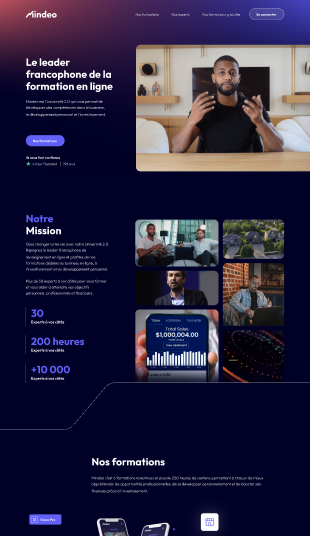
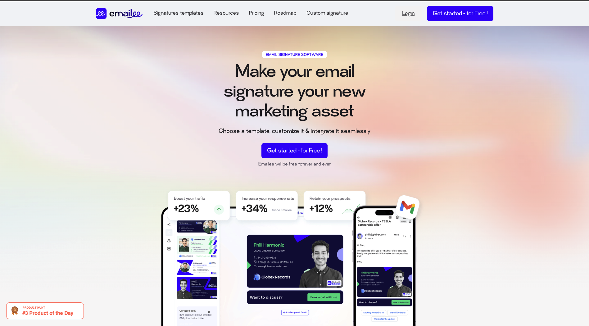
Landing pages are critical for the success of any advertising campaign. However, they can quickly turn into conversion sinkholes if they contain strategic errors. Even the best campaigns can fail if the landing page is not optimized properly. In this article, we will explore the most common landing page mistakes and show you how to fix them effectively to improve your conversion rates.
1. Too Many Conversion Goals on the Same Landing Page
One of the most common landing page mistakes is asking too much from visitors. When you offer multiple conversion goals on the same page, it can create confusion and dilute the impact of each call to action (CTA).
How to fix this mistake?
Instead of offering several CTAs for different actions like "buy now," "request a demo," or "download a guide," focus on one specific goal. For example, if you want your visitors to sign up for a free trial, ask for nothing else.
2. Assuming Short Forms Always Convert Better
Another common mistake is believing that the fewer fields in a form, the higher the conversion rate. While this can be true in some cases, overly short forms can reduce the quality of your leads.
How to fix this mistake?
It’s often better to use step-based forms, like the Breadcrumb Technique, which divides a long form into several easy-to-fill-out steps. This allows you to collect information while reducing the feeling of intrusion. For example, start with simple questions about interests and goals before asking for more sensitive information like email or phone number.
3. No Alignment Between Ad Copy and Landing Page Copy
When the copy in your ad doesn’t match the copy on your landing page, visitors may feel confused. This inconsistency can hurt your conversion rate because visitors don’t find what they were expecting when they land on the page.
How to fix this mistake?
Make sure the message and tone of your ad match exactly with those on your landing page. If your ad highlights a special offer or specific product, your landing page should immediately remind visitors of that offer to reinforce consistency and build trust.
4. Neglecting Mobile Optimization
A large portion of web traffic now comes from mobile devices. If your landing page isn’t optimized for mobile, you risk losing a significant share of your prospects.

How to fix this mistake?
Ensure that your page is responsive, meaning it automatically adapts to the visitor’s screen size. Regularly test your pages with Google’s Mobile-Friendly Test tool to guarantee a smooth user experience.
5. Forgetting the Thank You Page
The thank you page is often overlooked but plays a crucial role in the conversion process. A well-optimized thank you page can encourage visitors to take the next step, whether that’s completing their purchase or further engaging with your content.
How to fix this mistake?
Instead of just showing a simple thank you message, use this page to strengthen your relationship with the user. Add social proof elements like testimonials or client logos to reassure your prospects. You can also suggest additional steps, such as booking a demo or adding a product to their cart.
6. Failing to Address Visitor Objections
Visitor objections, like the fear of committing to a free trial or providing personal information, are common. If these are not proactively addressed, they can lead to drop-offs.
How to fix this mistake?
Use microcopy to subtly address objections. For example, add a message under your CTA saying that the trial is free and commitment-free. You can also include customer reviews or guarantees to reassure your prospects.
7. Ignoring the Importance of Social Proof
Social proof is essential for reinforcing the credibility of your offer. If you don’t show that other users or customers are satisfied, you risk losing the trust of your visitors.
How to fix this mistake?
Add customer testimonials, case studies, or star ratings at strategic points on your landing page. At ConvertLab, we recommend placing these elements above the fold and near your CTAs for maximum impact.
8. Not Optimizing Visual Hierarchy
A poorly structured landing page can cause confusion and prevent visitors from quickly understanding what you want them to do. A well-thought-out visual hierarchy helps guide the visitor’s attention and leads them to the desired action.
How to fix this mistake?
Use different font sizes, contrasting colors, and well-defined spaces to highlight important elements. For example, place titles and CTAs in strategic areas following a Z or F pattern, which aligns with how users read pages.
9. Using Generic or Poor-Quality Images
Generic stock images can make your landing page feel impersonal and unengaging. They don’t show the real value of your product or service.
How to fix this mistake?
Opt for personalized and authentic images that genuinely illustrate your offer. For instance, show real product screenshots or photos of actual customers. This enhances credibility and helps establish a connection with your visitors.
10. Neglecting A/B Testing
A/B testing is crucial for improving landing page performance, but many businesses conduct tests without enough data or traffic to achieve meaningful results.
How to fix this mistake?
Before launching an A/B test, ensure that you have enough traffic to obtain reliable results.
What You Should Take Away
Landing page mistakes can be costly, but they are avoidable. By applying the advice above and focusing on providing a smooth and optimized user experience, you can improve your conversions and maximize the return on investment from your advertising campaigns. To go further in optimizing your landing pages, ask us for a free audit.


